Product UX Design for Paychex
Payroll Tracking
UX leadership, vision, and execution designer for a suite of pivotal, internal-use applications.
A keen eye observing every penny
This payroll provider employs internal teams responsible for monitoring payrolls moving through various financial channels between banks and accounts. These financial watchdogs are payroll specialists, risk evaluators, and fund recoverers.
This solution centralized a previously disorganized workflow. It pulls together all information into one spot and then serves it in an interface tailored to the users’ roles and needs.
They can track every penny from when a client submits a payroll to when the bank receives it to when it settles into an employee’s account–and everywhere in between.
Dashboard
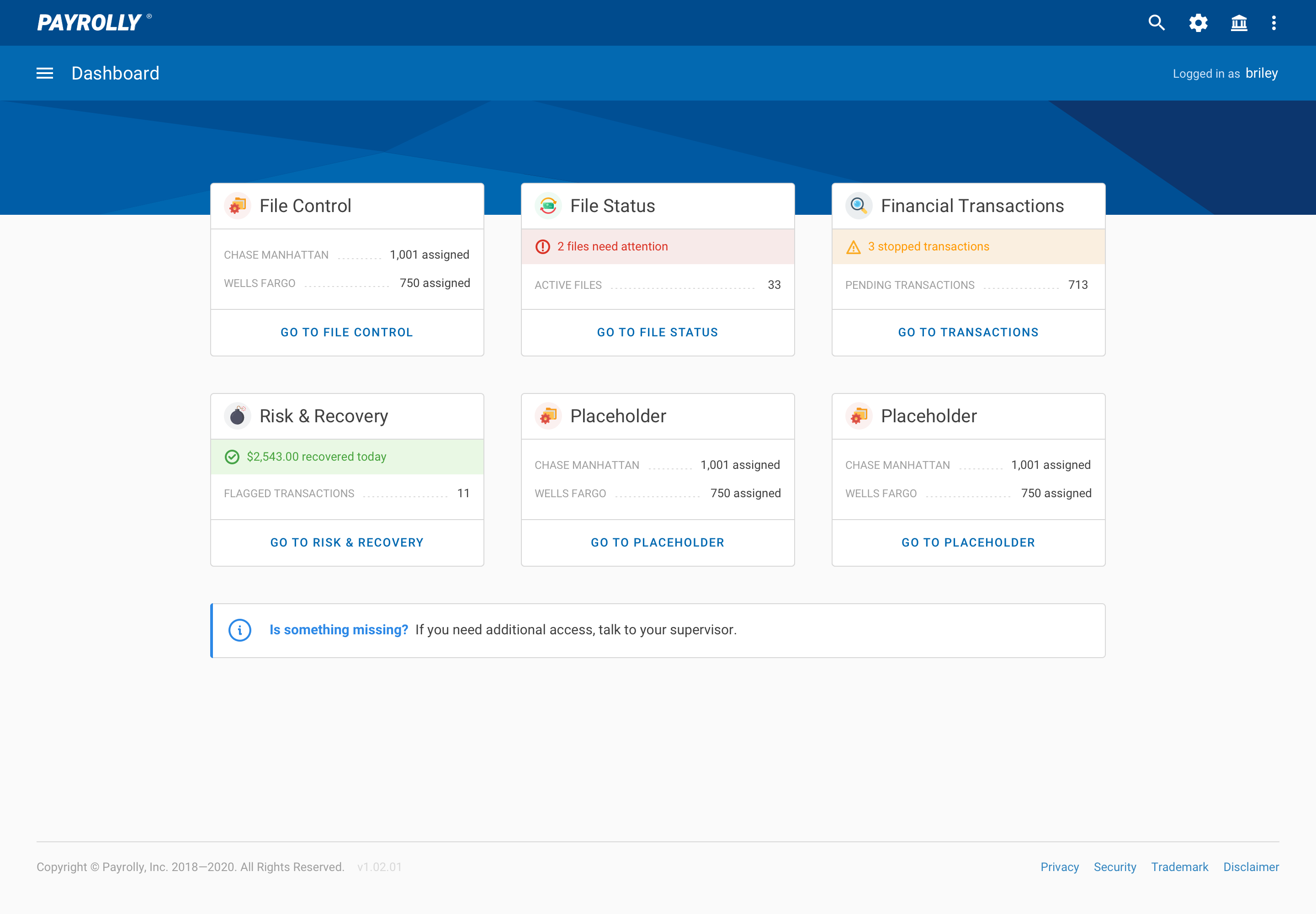
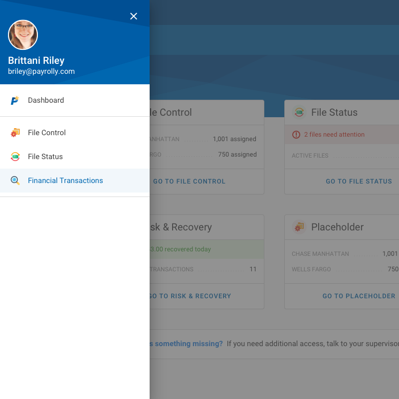
I designed a dashboard as the main entry point for users.
Each tile is tied to a piece of main functionality and shows critical information in a digestible manner.
The dashboard is customizable and scalable. As new functionality is rolled into this solution, accompanying tiles will be developed.
Transaction Search Panel
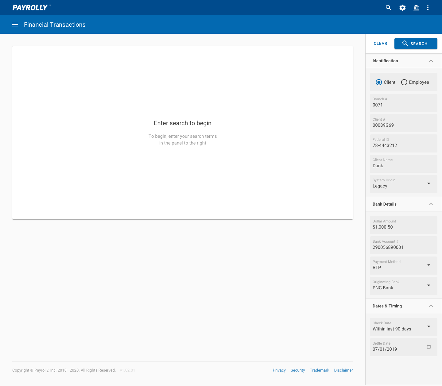
The Financial Transactions application presents tidy but robust functionality.
Users can search for any transaction in any status by inputting values in the righthand search panel.
Three categories of criteria can be collapsed or expanded to hide or reveal the search fields within.
Example–A payroll specialist may be on the phone with a client’s employee who was due a paycheck for $1,500.00 but never received it. By searching using relevant criteria, the specialist can look up that transaction and determine what happened.
Search Results
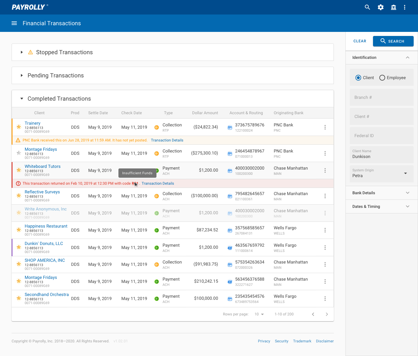
The number of search results returned depends on how narrow or broad the criteria entered are. For example, a specialist may want to see a comprehensive history of all of a single client’s transactions or every transaction across all clients with a specific check date.
The list sorts transactions into three statuses–stopped, pending, and completed.
Each row represents a transaction and serves up a large amount of information in an organized, spreadsheet-like manner.
The column order, icon language, visual hierarchy, terminology, and interactions were designed in close collaboration with and tested by the end users themselves.
Payroll View
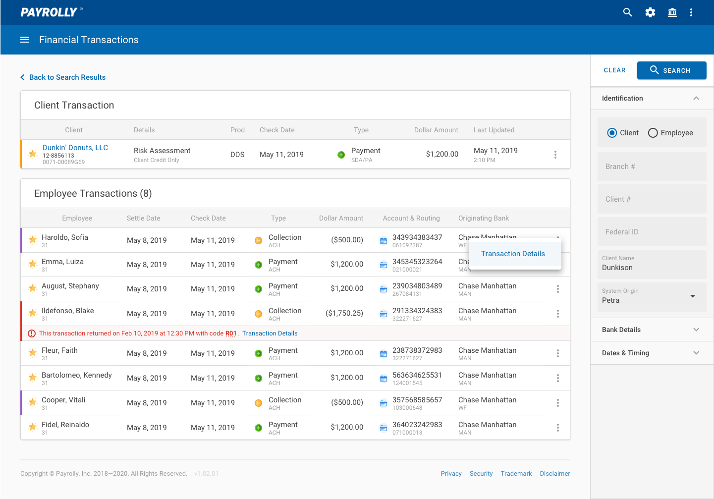
A user can click the icon at the end of a row to open an action menu and access the “payroll view” for that transaction.
A “payroll” generally consists of a collection (debit) from the client account and several payments (credits) to the accounts of that client’s employees.
The “payroll view” pulls all those related transactions together to offer a birds-eye view of the payroll itself. This makes it easier to spot fraud or other errors at a glance.
Details Drawer
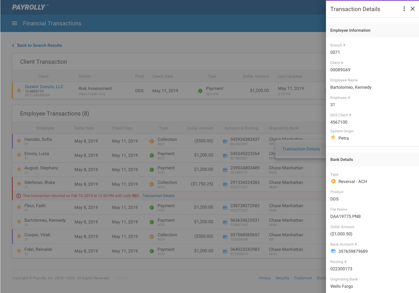
A user can open the Transaction Details drawer for each transaction.
While the Search Results grid displays much information, the Transaction Details Drawer shows even more.
Here, a user can drill down into every bit of data available for a single transaction. This is the most granular view. All the information in this drawer can be easily exported to various formats for review and discussion, audit purposes, and other use cases.
Obligatory disclaimer for this project. All the information shown (company names, dollar amounts, account numbers) is fake. All design work, and the design system this is built on, were created by me. The final design and implementation is the sole property of Paychex and is shown here for non-commercial, portfolio-y purposes only.
